Reordering Name Cards: Keeping Your Brand Consistent
Make the next batch feel like part of the same identity. Keep a clear specification, review changed details and agree how paper, colour and finishing should be reproduced.
Reorder from a specification, not a photograph
An old card is a useful reference, but a phone photograph cannot tell a printer everything about the original job. It may hide the stock, surface finish, exact dimensions and how the colours were produced. A request to “make it the same” works better when it comes with the information behind the appearance.
Keep a small reorder record with the approved artwork, paper description, printed sides, finishing and previous order reference. If the business has changed its brand guidelines, identify which version now applies. A repeat order should start from the current approved identity, not simply the last attachment somebody can find.
Create a practical master specification
Record the details that need to stay consistent:
- Finished dimensions and whether the card has square, rounded or another shaped edge.
- Exact stock name and weight, including the shade where relevant.
- Printed sides, lamination and any foil, Spot UV, embossing or die cutting.
- Approved logo artwork, typefaces and colour references.
- Front-and-back files, artwork version, approval date and quantity for each name.
Keep editable source artwork separately from the final print PDF, with access limited to the people maintaining the brand. The print-ready file is the production handover; the editable master is what makes later corrections manageable. When requesting a repeat job, send the approved reference and the current files together so the print team can confirm the specification.
Check information that may have changed
A reorder is a useful moment to review names, job titles, departments, email addresses, telephone numbers and office details. Scan every QR code and check that its destination still belongs to the organisation and contains current information. A link can stop being useful even when the printed card looks unchanged.
Separate a simple repeat from a content update. If nothing changes, say so and still review the current proof. If only a name changes in the same layout, the name-only artwork service may fit. Updates to other text, logos or layout need the appropriate service. Clearly identifying the changes helps avoid unnecessary redesign while keeping the work correctly scoped.
Keep paper and finishing decisions visible
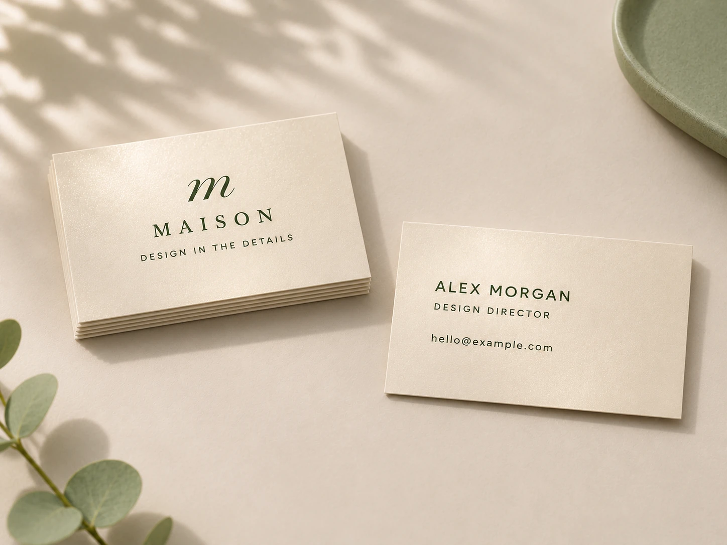
Paper is part of the design. A cream or brown stock changes the background seen around the printed artwork. A smooth laminated card and an uncoated card can also give the same layout a different appearance and feel. “350gsm” alone is not a complete paper specification.
If the original stock or finish is unavailable, ask what substitute is proposed before approving production. Consider its shade, surface, thickness and suitability for the artwork. A physical sample can be useful where the difference matters; ask what can be provided and how it affects the schedule and quotation.
Record an agreed substitution as a new specification version. That gives future orders a clear reference instead of leaving the team unsure which batch represents the current standard.
Discuss colour expectations before printing
Keeping the same artwork helps, but it is not a promise that every batch will look identical. Printing method, paper and production conditions can affect the result. A screen proof is useful for reviewing layout and content; it should not be treated as a physical colour sample.
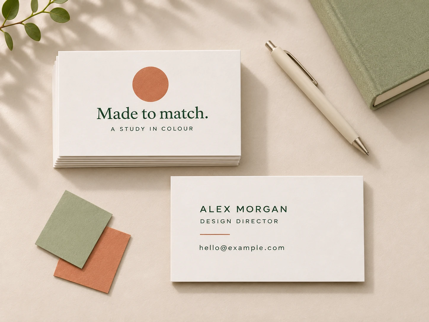
If a brand colour is critical, provide the actual reference used in the brand guidelines and discuss whether the job is intended for CMYK or a separately specified spot ink. Adobe's guidance explains that the appearance of a printed spot colour depends on the ink and paper. A colour reference needs to be considered alongside the material and production method.
Ask which proof or sample is appropriate for your requirement and whether there are additional costs or lead times. Avoid relying on a screenshot of a previous card or an unconfirmed “exact match” expectation. Our Spot Colour Name Cards are quoted around the actual ink, stock and quantity requirements.
Keep files and approvals in a clear sequence
Choose one naming method for the master artwork and proof files. For example, Brand_Namecard_Master_v04.pdf is easier to distinguish from an earlier version than several files named “final”. Add the person's name or department where a file contains individual details. Keep the approval record with the exact version it refers to.
For a team update, test the layout with longer names and titles before replacing every person's details. A new title may need more space even when the overall identity stays the same. Check both sides and review the intended print size, not only an enlarged view on screen.
Keep the superseded files in a clearly labelled archive, separate from the files being submitted. If you make a correction after receiving a proof, review the revised proof before approval. This gives the next person managing the order a traceable starting point.
Make the next handover easier
Before submitting a repeat order, send the current specification, approved reference, new quantities, a concise list of changes and the required arrival date. Include the destination and recipient if they have changed. Different quantities or production timing can affect the price even where the design remains the same.
For the rebuilt Namecards.com.sg site, previous-system order history is not available in the new customer account. If you are referring to an older order, provide your saved order reference and artwork or a sample where possible; do not assume that signing in will restore the historical files.
After delivery, keep a clean reference card and the final specification with your brand records. Consistency comes from making those decisions easy to find, review and repeat. For a new starter, a department update or a larger brand refresh, that record makes the next brief much clearer.
A few useful answers
Will a repeat print run be exactly the same colour?
Identical appearance across batches should not be assumed. Share the approved specification and colour reference, and discuss the production method, stock and suitable proofing where colour is critical.
Can I reorder from a photograph of my old card?
A photograph can help explain the design, but it is not a complete print specification or reliable physical colour reference. Provide artwork and stock details where available; ask about recreating missing artwork if needed.
Do I need to approve artwork again for a reorder?
Review and approve the current proof before printing, especially if names, contact details, quantities or layout have changed. Keep the approval with the exact file version.
Where are orders placed on the previous website?
Previous-system order history is not available in the rebuilt account area. Include any saved reference, artwork and specification when asking us about an older order.